No one intentionally sets out to create an inaccessible product or digital experience.
Yet in 2022 many websites are still inaccessible, creating barriers for users. As requirements and best practises evolve, companies are constantly adapting to create more accessible experiences. In 2015, Twitter pulled two advertisements from their platform Vine that had 6 seconds of flashing video, which triggered epilepsy episodes from some users. Up until just last year, Netflix used auto-play to show trailers, which can trigger negative physical responses from those with disabilities.
So how do we keep up with best practises and avoid creating inaccessible experiences? Within the world of web design, we make our digital experiences accessible by following Web Content Accessibility Guidelines (WCAG). It doesn’t just feel good to make inclusive products, it’s part of the law. Under the Accessible Canada Act (Bill C-81), Governments, businesses, and organizations are required to provide equal access to users with disabilities. Creating products that are accessible allows businesses and organizations to expand their market potential, protect themselves from legal backlash and maintain a positive brand image. We’ve compiled a list of tips and examples to help ensure your business or organization’s website is fully accessible.
1. Be Mindful of Colour Contrast
Color blindness affects approximately 1 in 12 men (8%) and 1 in 200 women in the world. Having inadequate colour contrast between text and background colours can make your website difficult to read, especially for users with low vision. Avoid colors that have too much intensity or brightness as this can decrease readability and can be harmful for those with high photosensitivity. Use an online tool like SiteImprove’s colour contrast checker to assess the right contrast ratio. To check if your website is visible for those with color blindness, you can also use the Chrome extension from Siteimprove.
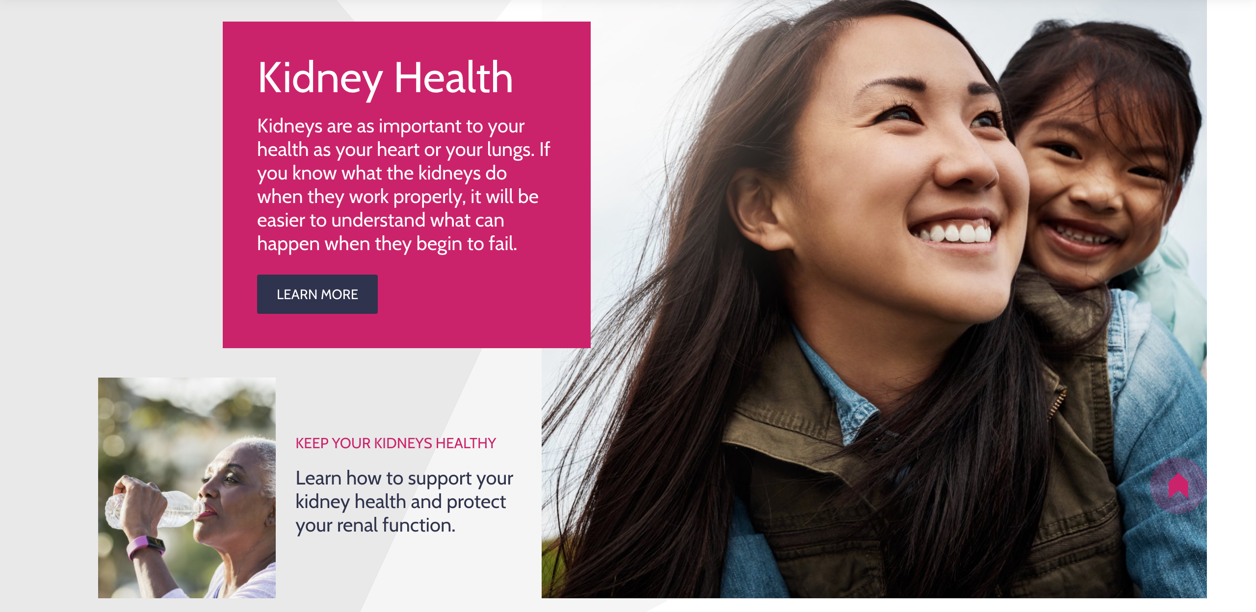
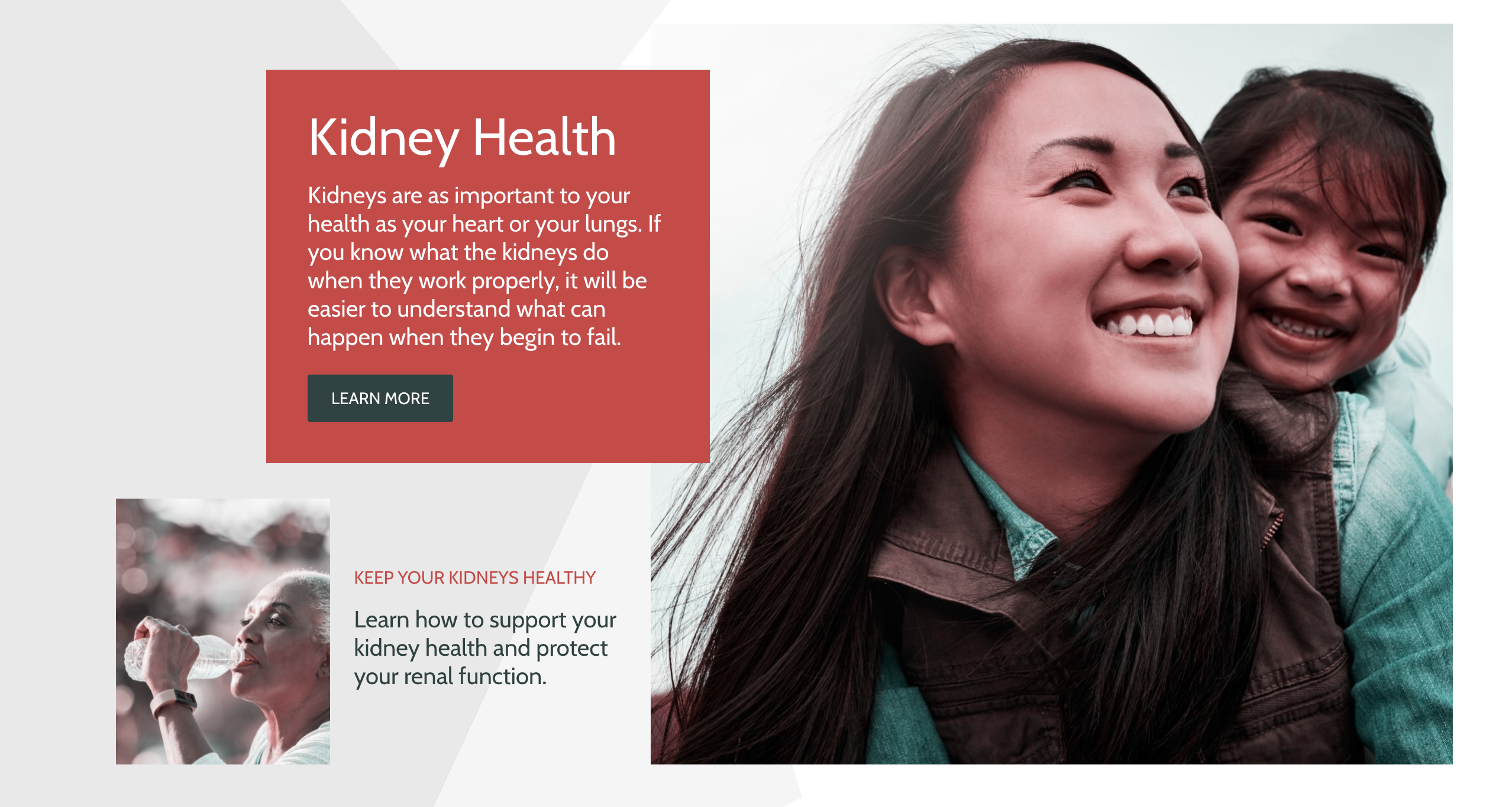
A comparison of Kidney.ca and what the website looks like through a blue-yellow colorblind filter from the Siteimprove Chrome extension.
2. Create an Accessible Navigation
It’s important to make sure all content can be accessed using a keyboard in a logical way. Users with visual impairment may be using screen readers. It's important to allow these users to skip navigation links so they can navigate through the sections they want to find what they’re looking for.
A screen reader demonstration from BeThere.org, a website designed by AKA New Media.
3. Make Text Accessible
Uneven spacing in text can occur if text is right or left justified, which can make it hard for those with cognitive disabilities to read the text. Make sure text is a readable font, and at least 16px for the body text on webpages. Put careful thought into text choices and treatment. For example, Italics can be hard for users with disabilities to read and underlining text can be mistaken for a link.
4. Describe Your Links
All hyperlinks on a website should include descriptive text to let users know where the link goes. Never name a link “Click Here.” This makes for bad usability and diminishes the user experience. Instead, use a verb that’s related to the task that describe what the user is clicking into.
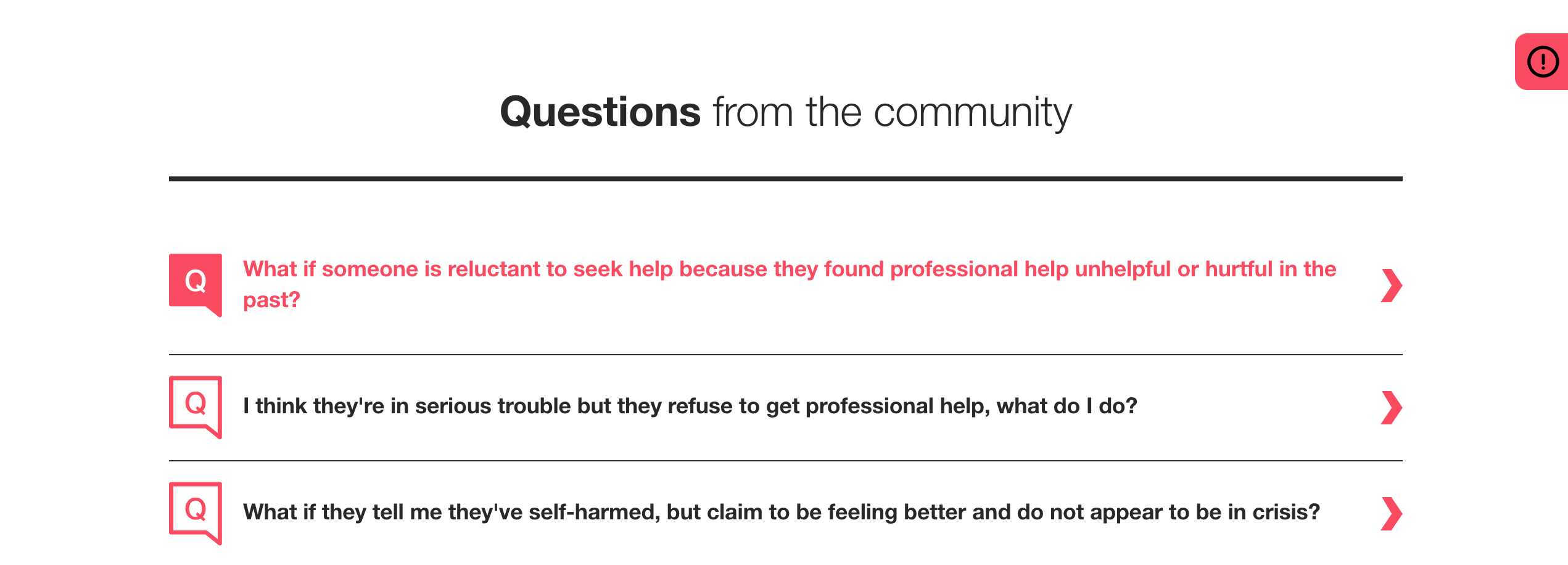
Links from BeThere.org, a website designed by AKA New Media.
5. Include Alt Text
A common accessibility mistake is missing or inaccurate alt text on websites. Alt text is embedded into the code of an image and is used to describe the image. Alt text should always be included so that the text can be read out loud for those with screen readers. Keep alt text concise as screen reader users may want to navigate through them quickly.
6. Use proper Headings
Screen reader users often use headings to navigate through content-heavy pages, so it’s important to follow best practises when using headings. Headings are ranked <h1> through <H6> based on hierarchy. All pages should have at least a <h1> for the title of a page. Use them to add structure to your content and describe what each section of content is about. Using headings also allows Google to understand your content for SEO purposes.
7. Make Accessible Forms
Use Clear labeling above the form field rather than in it. Avoid empty form labels. Ensure you add a <label> element in your code for each form field or screen readers will have trouble navigating through it. All forms on the raisin platform are labelled out-of-the-box. If using a Captcha, there should be audio or another accessible option for those with visual impairment.
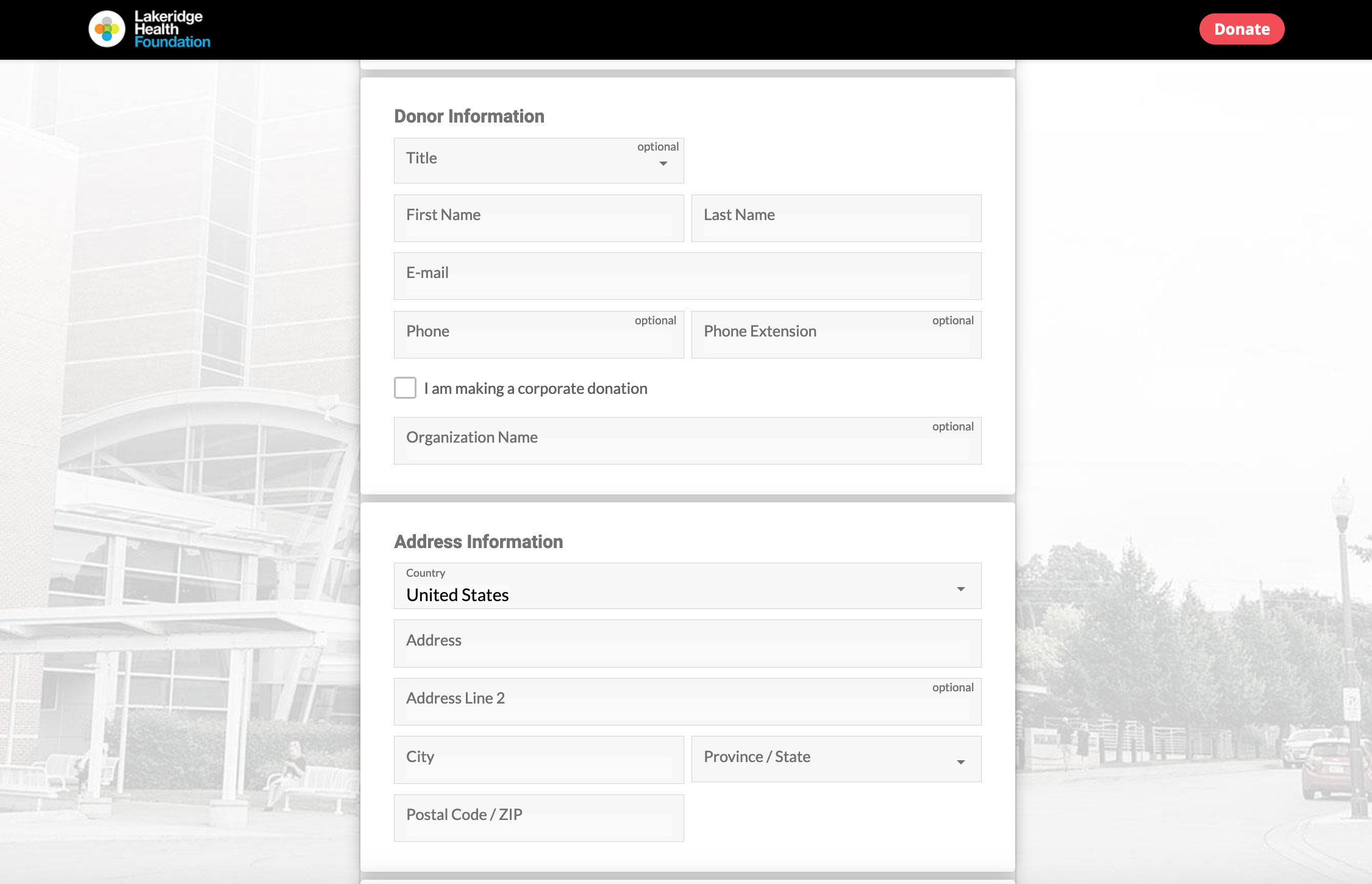
Lakeridge Health Foundation, built using raisin's Donations module.
8. Use Captioning for Videos
41% of videos are incomprehensible without the sound. Captions are a simple solution that can fix this. Besides users with hearing impairment, captions benefit a wide variety of users, such as those who are expanding their vocabulary with a second language.
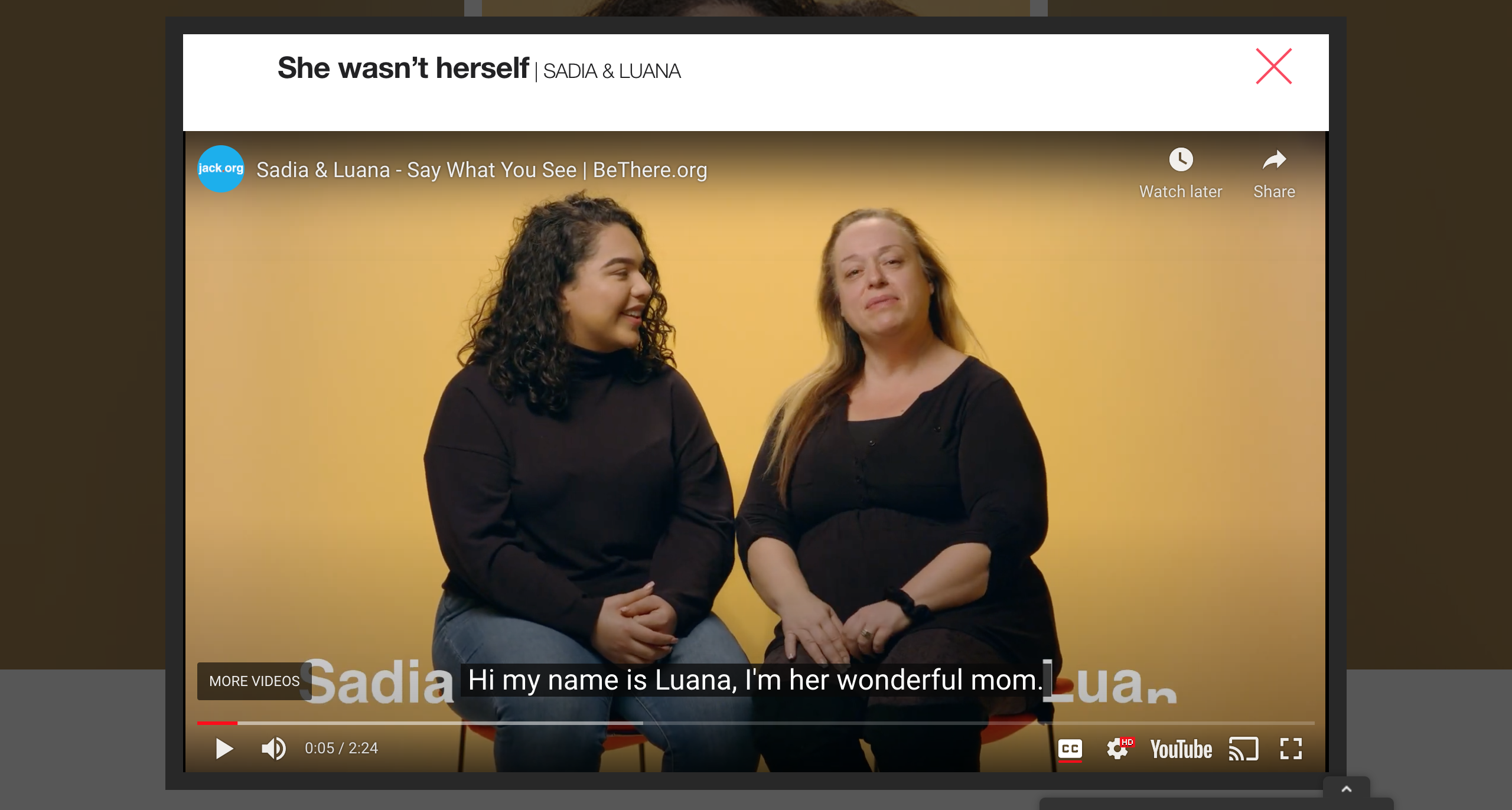
BeThere.org (and initiative of Jack.org), designed by AKA New Media, shows closed captioning option from an embedded Youtube video.
9. Dynamic Content
For dynamic content, ARIA roles and alerts can also be used so that screen readers become aware when overlays, lightboxes, popups and modal dialogs update dynamically. Otherwise, users with screen readers may not be aware of content updating.
10. Avoid Auto-play
Apart from triggering seizures, auto-play can create confusion or be distracting especially to those with cognitive disabilities, and can frustrate those using text-to-speech software. Auto-play has little benefits and many drawbacks. Even to fully-abled people, it’s considered annoying by most users and many will immediately turn off the sound when a video starts auto-playing.
There are many considerations we need to account for when designing AODA compliant websites. Contact us to learn more about how our digital experts can help make your fundraising website fully accessible.